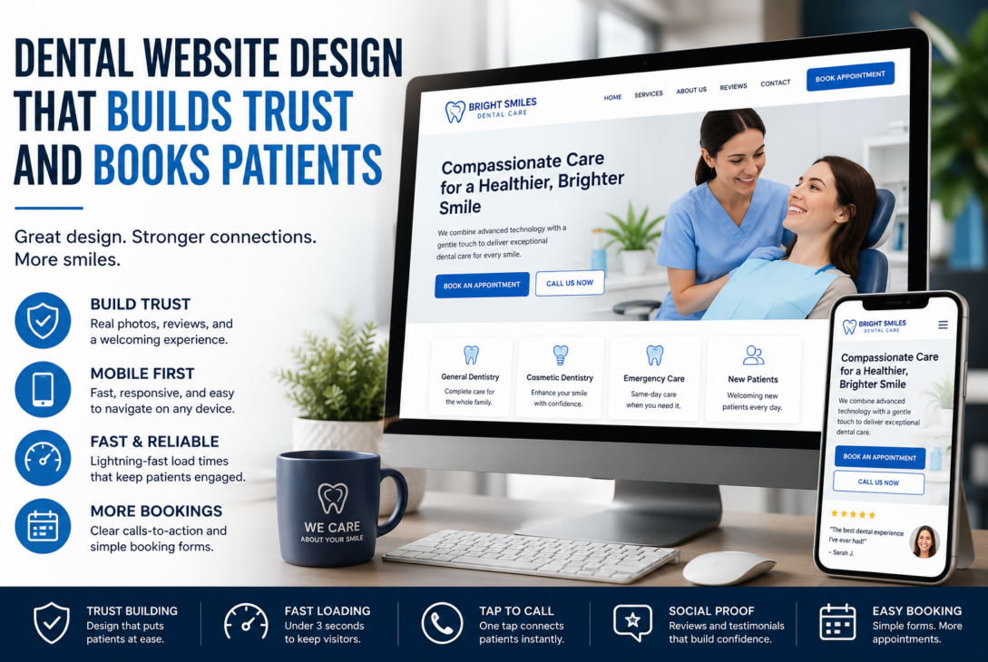
Your website is often the first handshake between your practice and a potential patient. Before anyone calls your front desk, they scroll through your homepage, judge your photos, and decide in seconds whether they trust you with their smile.
That split-second judgment is the real power of dental website design. Get it right, and your site becomes a steady stream of new patient bookings. Get it wrong, and even the best dentistry in town won’t fill your chairs.
Studies show most patients research a practice online before ever picking up the phone, and sites built for conversion consistently out-book generic template designs. The difference almost always comes down to design choices that either build trust or quietly chip away at it.
Let’s break down exactly how this works.
First Impressions Build (or Break) Trust
Dental visits make many people nervous before they even arrive. Your website is where that anxiety either gets calmed down or ramped up.
Calming Visuals Matter
Soft blues, gentle greens, and generous white space do more than look nice. They lower visual stress and make pages easier to read at a glance.
Cluttered layouts and harsh colors send the opposite signal — that the practice itself might feel chaotic or rushed.
Real Photos Beat Stock Photos
Generic stock photography is an instant trust-killer. Visitors can tell when a “team” doesn’t match the practice they’re about to visit.
Custom dental websites that feature real photos of the dentist, staff, and office interior feel far more approachable. Patients want to see who they’ll actually meet.
Social Proof Seals the Deal
Prominently placed patient reviews, before-and-after case studies, and short video testimonials do the convincing work your sales copy can’t. People trust other patients more than they trust marketing language.
This is one reason a well-planned dental web design company builds review widgets and testimonial sections directly into the homepage layout, not buried three clicks deep.
Mobile Responsiveness and Load Speed Decide Who Stays
The majority of dental website traffic now comes from phones, not desktops. If your site isn’t built mobile-first, you’re losing patients before they even see your services.
The Three-Second Rule
If a page takes longer than three seconds to load, most visitors bounce straight to a competitor’s site. Slow-loading images, bloated plugins, and unoptimized code are silent booking killers.
Google’s own PageSpeed Insights tool is a useful starting point for checking where your site stands.
Thumb-Friendly Design
A tap-to-call button should follow the visitor down the page on mobile, not disappear after the first scroll. The easier it is to reach your phone number, the more calls you’ll get.
Shorter Forms Convert Better
Mobile booking forms should ask for the minimum information needed — name, phone, and preferred time. Every extra field is a chance for someone to give up halfway through.
This is exactly the kind of detail that separates thoughtful dental website development from a rushed template install.
Clear Information Hierarchy Reduces Friction
Patients arrive with specific questions. If your site makes them dig for answers, they’ll leave and search elsewhere.
Insurance Information Up Front
Listing accepted insurance providers clearly saves patients from calling just to ask. It also filters in visitors who are more likely to book, since they already know you accept their plan.
Dedicated Service Pages
Separate pages built around specific searches — like “Emergency Dentist Near Me” or “Invisalign Consultation” — capture visitors who already know exactly what they need. This kind of targeted dental website optimization tends to bring in higher-intent leads than a single crowded services page.
Simple, Focused Navigation
Limiting your main menu to five to seven clear labels prevents decision fatigue. When visitors aren’t sure where to click, they often just leave instead of exploring further.
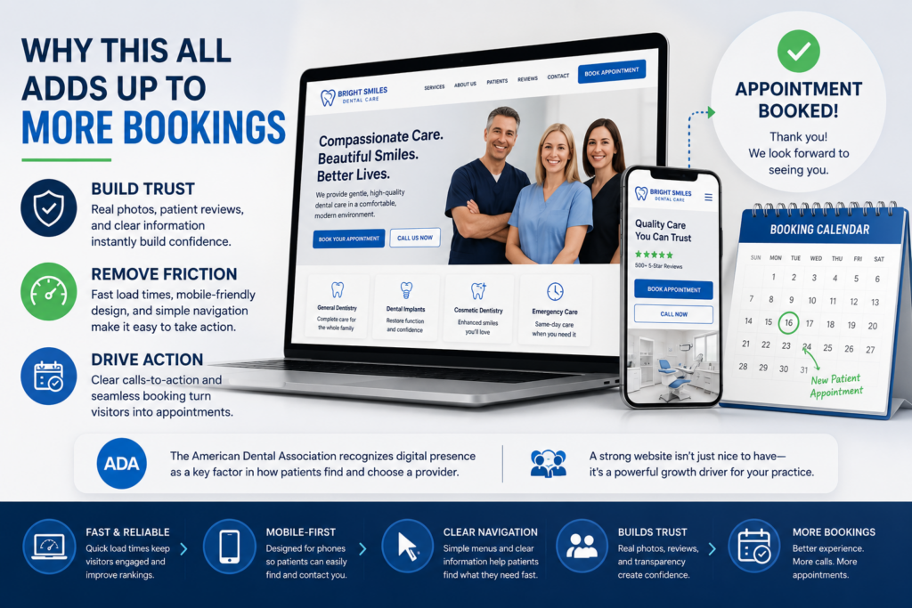
Why This All Adds Up to More Bookings
None of these elements work in isolation. A fast-loading, mobile-friendly site with real photos and clear navigation creates a smooth, reassuring path from “just looking” to “appointment booked.”
This is the core idea behind modern dentist website design: every design choice should either build trust or remove friction, ideally both at once.
Practices that treat their website as a marketing asset — not just a digital brochure — consistently see the payoff in their booking calendar. The American Dental Association itself highlights digital presence as a growing factor in how patients choose a provider.
Bringing It All Together
Dental website design isn’t a one-time project you finish and forget. It’s an ongoing relationship between how your site looks, how fast it loads, and how easily patients can take the next step.
Small, consistent improvements — a faster homepage, a clearer menu, a review section that actually gets seen — compound into meaningfully more new patient bookings over time.
If your current site isn’t converting visitors into booked appointments, it may be time for a fresh look. Reach out today to talk about how a redesign focused on trust, speed, and clarity could turn your website into your busiest referral source.